
blog
Email CSS Support: What to Check Before Approving a Campaign
See tested Gmail, Outlook and Apple Mail examples of email backgrounds, columns, logos, fonts and preheaders, with practical fixes for marketing teams.
The background vanishes in Outlook. The columns refuse to stack on a phone. A line of hidden preview text appears above the logo. These can look like three versions of the same complaint: "the email is broken."
They need different repairs. Email CSS controls presentation, including colors, spacing and layout, but support depends on the receiving app and the way the template uses each rule. For a marketing team, the useful question is whether the offer, brand and action survive in the clients customers use.
Here are concrete results from MailSlurp tests on September 29, 2026, and the decisions they support. You can download the source emails and use the linked guides to investigate a matching problem in your campaign.
What changed in the tested emails
We imported controlled saved-email files into MailSlurp and inspected the completed client captures. The examples isolated particular features where practical: logo embedding, background placement, font fallbacks, column layout and preheader hiding. They were direct imports, not fresh sends through Mailchimp, HubSpot or another ESP.
Each row below describes those samples and named targets. It is not a universal compatibility rating. An untested client is untested, even when another app with the same brand name looks correct.
| Feature | Observed result | Tested clients |
|---|---|---|
| Background | Absent or oversized | Classic Outlook; Gmail Android |
| Mobile columns | Revised blocks stacked | Gmail Android; iPhone Mail |
| Preheader | Inline repair hid body text | Gmail Android; Gmail iOS |
| Font fallback | Price/date line wrapped differently | Gmail web; Classic Outlook; Apple Mail |
| Linked SVG and PNG | Both icons visible | Five clients listed below |
| Inline SVG | Visible only in Apple Mail | Same five clients |
| Dark-mode logo | Transparent wordmark lost contrast | Gmail Android dark |
The logo checks used Gmail web, Gmail Android, Outlook Classic for Windows, New Outlook for Windows and Apple Mail macOS. The individual guides provide the full results, source files and screenshots. We did not test every feature in every one of those clients.
When a background becomes the problem
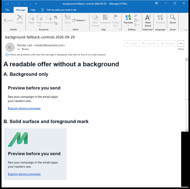
The comparison below contains two versions of one small email. The first places a logo behind the copy. The second gives the copy a solid surface and places the icon in its own space.
Outlook Classic: missing background
Gmail Android: oversized background
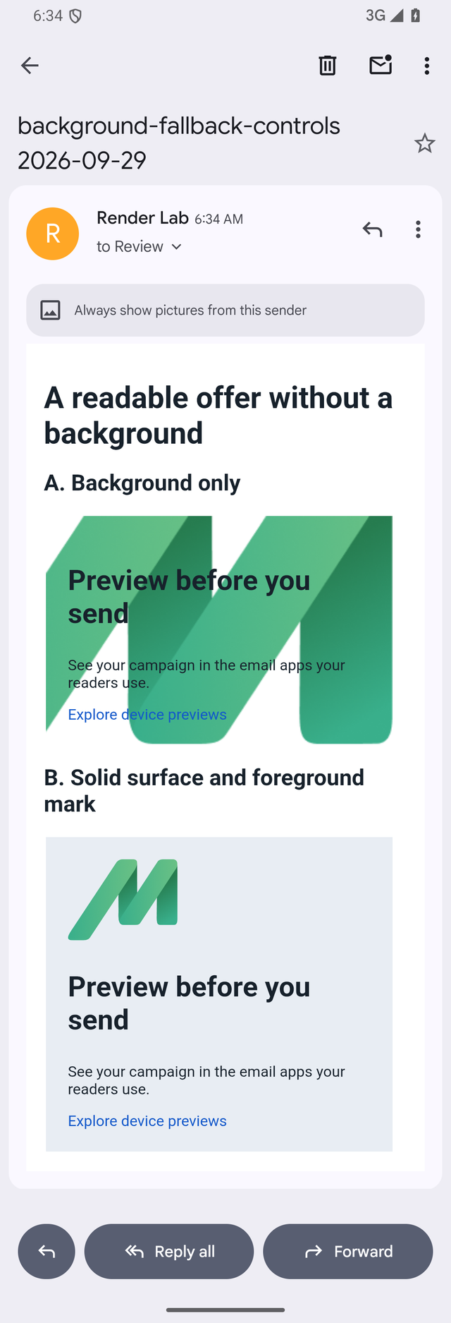
The lower version preserves the message without depending on how the app sizes a background. That does not mean every campaign needs to lose its layered hero. It gives the designer a choice: keep the layered treatment with a tested client fallback, or simplify the composition.
Use the background-image fallback guide to make that decision. If a normal image is missing too, start with image URLs, formats and useful text fallbacks.
When the layout rule keeps columns together
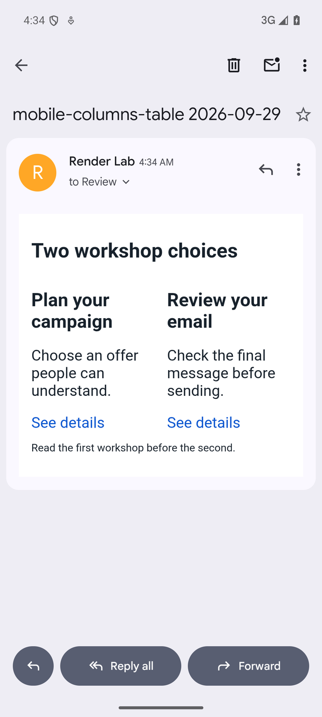
In this smaller experiment, both emails contained the same two workshop descriptions. Each block requested 280 pixels of width. Only their display rule changed: table-cell behavior in the first version, wrapping inline-block behavior in the second.
Before: columns stay together
After: content wraps into one column
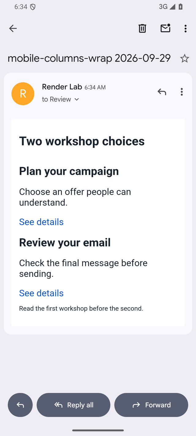
Both phone targets stacked the revised blocks. This is a repair to evaluate, not a promise that converting every table to inline blocks will fix an entire campaign. A desktop layout, a longer product name or the ESP's processed output still needs its own check.
The iPhone and Android testing guide connects this example to a complete campaign review. For headline and price wrapping inside a block, use the font-fallback test instead.
What inline CSS can fix
Inline CSS places a style directly on an element. An embedded style block groups rules inside the email. Both can be useful. The important distinction is what the receiving client supports and what the final template actually contains.
Google's Gmail CSS reference documents class, element and ID selectors, supported properties and media queries, while warning that unsupported rules may be ignored. "Gmail ignores all style blocks" would therefore be an inaccurate diagnosis.
In our preheader repair, applying the hiding treatment directly to the affected element resolved the visible body text in the tested Gmail apps. That result supports that repair. It does not establish that every inline rule works or that every embedded rule fails.
For an ESP campaign, ask the template owner whether the editor already applies important styles inline. Then test what it sends. There is little value in approving a hand-edited file if the scheduled campaign will use another version.
Keep the email small enough to read in full
CSS and repeated markup contribute to the HTML payload. They are not free simply because the customer cannot see them.
Our Gmail clipping experiment used three emails with the same short visible newsletter. The version with 117,984 bytes of decoded HTML was clipped in Gmail web; versions with 74,976 and 17,952 bytes showed the footer. Much of the difference was redundant markup.
Those observations are not a universal byte boundary. They are a practical reason to inspect the delivered source when the footer is missing. Reducing a remotely hosted photograph's file size can improve loading, but it does not remove repeated HTML from the email.
Give the designer a precise repair request
"Make it work everywhere" leaves too much undefined. A useful report might say:
In Outlook Classic for Windows, the background icon is missing. The headline and link remain readable. Please keep the offer text and move the icon into a foreground image block, then send the revised campaign for a second preview.
Include the client and mode, the campaign revision, the screenshot and the part the customer cannot use. Ask for one focused change when possible. That makes the next comparison easier to interpret.
For related asset problems, use the SVG-versus-PNG logo test or the dark-mode contrast comparison. Animation needs an additional live playback check; a still capture cannot establish whether a GIF plays correctly.
Test the final campaign
Download the sample EML bundle to inspect or rerun these examples. EML is a saved-email format containing the message and HTML. The bundle includes a README describing the tests and their limits; it contains synthetic examples rather than customer messages. Image availability can change because the samples reference hosted artwork.
For the real campaign:
- Finish the offer, personalization, images, tracking links and footer in the ESP.
- Send the finished revision using the Mailchimp, HubSpot or Klaviyo rendering workflow.
- Inspect the named clients your audience uses, including relevant phone and dark-mode targets.
- Fix the observed problem, resend and compare the same target.
- Check another priority client for a regression and open the safe test links separately.
- Save the approved revision with the completed results, using the rendering QA checklist.
Teams that repeat this process can use the device-preview API to connect it to their existing testing workflow. The review still needs a clear standard: the customer can recognize the brand, read the offer and find the action.